
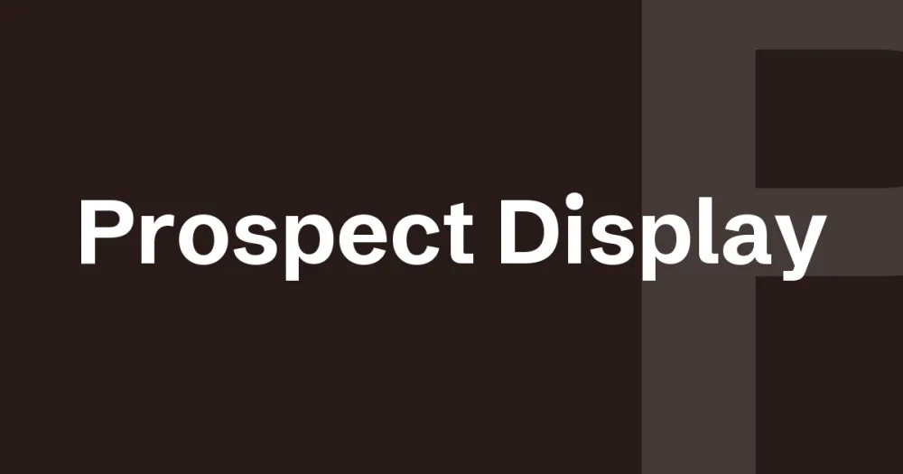
Prospect display font — by Pilgrim Fonts, $17 desktop license. Every figure below comes from the seller’s own listing.
Quick facts (verified from the Creative Market listing)
| Designer / Foundry | Pilgrim Fonts |
| Price | $17 desktop license (also Webfont/E-pub/App tiers) |
| Style | Display, all-caps, vintage |
| Release date | 22 February 2020 |
| File size | 257.02 KB |
| Formats | OTF, TTF |
Why it stands out
Prospect is drawn as an all-caps-only display face — there’s no lowercase to fall back on, which is a deliberate constraint rather than a missing feature. That constraint is what keeps it consistent for the kind of formal, classic headline work (logos, print, editorial mastheads) where mixed-case can undercut the vintage feel a design is going for.
At $17 for the desktop license, it’s one of the more affordable display fonts on this list, and has been on Creative Market since 2020 — long enough to have a track record rather than being a brand-new listing.
Popular on Creative Market as of 15/8/2026. Pricing and specs pulled directly from the product listing — verify current price/license before purchase, as Creative Market pricing can change.
Is there a free alternative to Prospect Display?
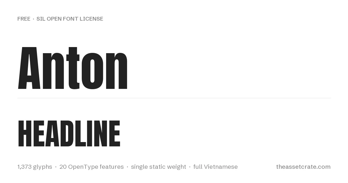
Yes. Prospect Display is a vintage all-caps display face, and all-caps display is the best-served category in the free library.
| Free font | What it matches | What you give up |
|---|---|---|
| Anton | Single-weight ultra-bold display drawn from advertising sans tradition, 1,373 glyphs and full Vietnamese | Contemporary rather than vintage — no period detailing |
| Oswald | Condensed gothic with variable weight 200–700 | Newspaper condensed, not vintage poster |
Every font in that table is released under the SIL Open Font License, is free for commercial use including client work, and can be downloaded from this site with its licence file included. The figures come from the font binaries, not from a listing.
When the paid font is worth it. Buy Prospect Display when the period character is doing real work — a vintage brand, packaging with a retro brief. For a plain bold headline, Anton is free and heavier. One practical difference worth checking before you decide: Anton carries full Vietnamese coverage including stacked diacritics, which many vintage display faces skip entirely, so if your project sets Vietnamese the free option may actually be the safer one. All-caps display faces also behave differently in tight layouts — with no lowercase to fall back on, line breaks land wherever the words allow, so test your longest headline before committing to either.
Where this sits among the other display faces
If you are still deciding, our Sans Serif Fonts comparison puts 5 premium faces side by side on the specifications that actually differ between them — desktop price, glyph count, ligature and alternate sets, included file formats and language coverage — with every figure read from the seller’s own listing rather than estimated.
That comparison is worth reading before any single purchase, because the two specifications that most often decide whether a font survives a real project are the two sellers are least consistent about publishing: whether web formats (WOFF, WOFF2) are in the download at all, and whether the character set extends past basic Latin to the accented characters your client’s name might need. Both are listed for every font in the comparison, including the ones where the seller publishes nothing and we say so.
Leave a Reply