
TAN Pearl is a display serif from TanType that has become a favourite in Canva font combinations shared on Pinterest and TikTok. It looks expensive: wide, high-contrast capitals with soft, ribbon-like curves running through letters such as A, E and R.
People look for fonts similar to TAN Pearl in Canva for two reasons. Either they cannot use the original in their design, or they need a free font they can also use on a website, in a document or in other software. TAN Pearl is a paid typeface, so for those jobs it needs its own license.
No free font copies TAN Pearl exactly. Its curved strokes are the whole point, and nobody gives those away. What you can find are open-source fonts that match one part of its character: the width, the contrast, the flared serifs or the playful shapes. Below are six of them, all free Google Fonts under the SIL Open Font License, each shown in a layout you might build in Canva.
What makes TAN Pearl recognisable
- Wide, calm capitals. The letters are generous and evenly spaced, which reads as premium.
- High contrast. Thick vertical strokes against very fine hairlines.
- Ribbon-like curves. Some strokes bend and loop, most visibly in the crossbars and legs of A, E and R.
- Display use. It is drawn for brand names, titles and short headlines, not for paragraphs.
When you compare fonts similar to TAN Pearl, decide which of these matters most for your design.
Six free fonts similar to TAN Pearl at a glance
| Free font | Closest to TAN Pearl in | What it gives up |
|---|---|---|
| Gilda Display | Wide, calm capitals and soft contrast | The curves |
| Elsie | Playful, slightly unusual letter shapes | Some of the width |
| Prata | High contrast and teardrop details | The softness |
| Bodoni Moda | Sharp, fashion-magazine contrast | Warmth; it is more formal |
| Noto Serif Display Light | Fine hairlines and airy width | Weight; it needs large sizes |
| Italiana | Delicate, elegant thin strokes | Weight and the flared serifs |
Fonts similar to TAN Pearl in Canva, side by side
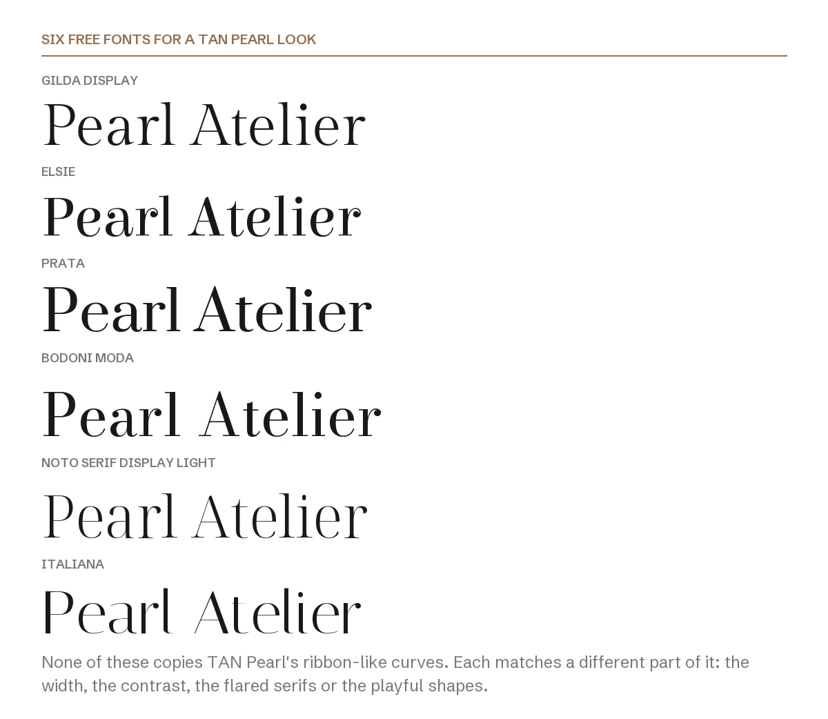
The same two words in all six fonts. Gilda Display and Noto Serif Display come closest in proportion; Elsie comes closest in personality.
1. Gilda Display
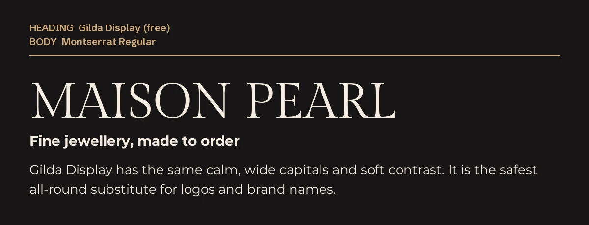
Gilda Display has the same calm, wide capitals and gentle contrast. It does not have the curls, but at a glance a brand name set in it gives the same quiet, expensive impression.
It is the safest all-round substitute, especially for logos and jewellery or beauty brands, and it is free on Google Fonts. Pair it with a light geometric sans such as Montserrat.
2. Elsie
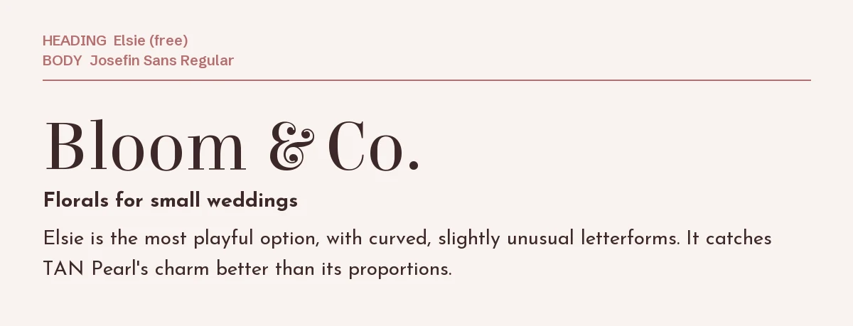
Elsie is the most playful option, with curved and slightly unusual letterforms that echo TAN Pearl’s charm better than its proportions. It feels romantic and a little vintage.
Use it for florists, weddings and gift brands, and set it large; the details disappear at small sizes.
3. Prata
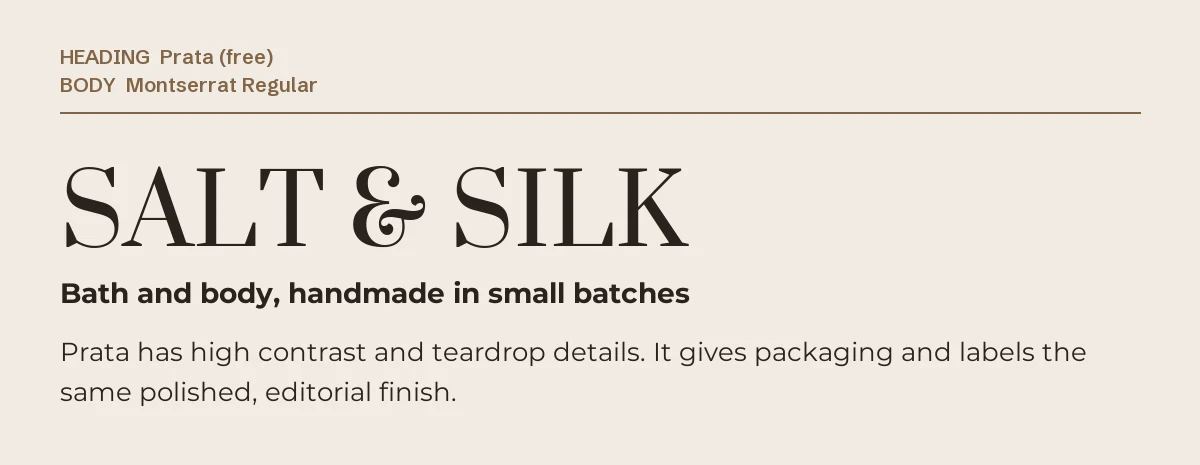
Prata has strong contrast and teardrop-shaped details. It gives packaging, labels and product posts the same polished, editorial finish, though it is crisper and less soft than TAN Pearl.
It also has a good ampersand, useful for names like the one above.
4. Bodoni Moda

Bodoni Moda brings the sharp contrast of fashion magazines. It is more formal and less playful than TAN Pearl, but it reads as luxury immediately and comes in several weights.
Choose it for fashion, photography and editorial work where precision matters more than charm. For a softer high-contrast serif, see our Playfair Display font page.
5. Noto Serif Display Light
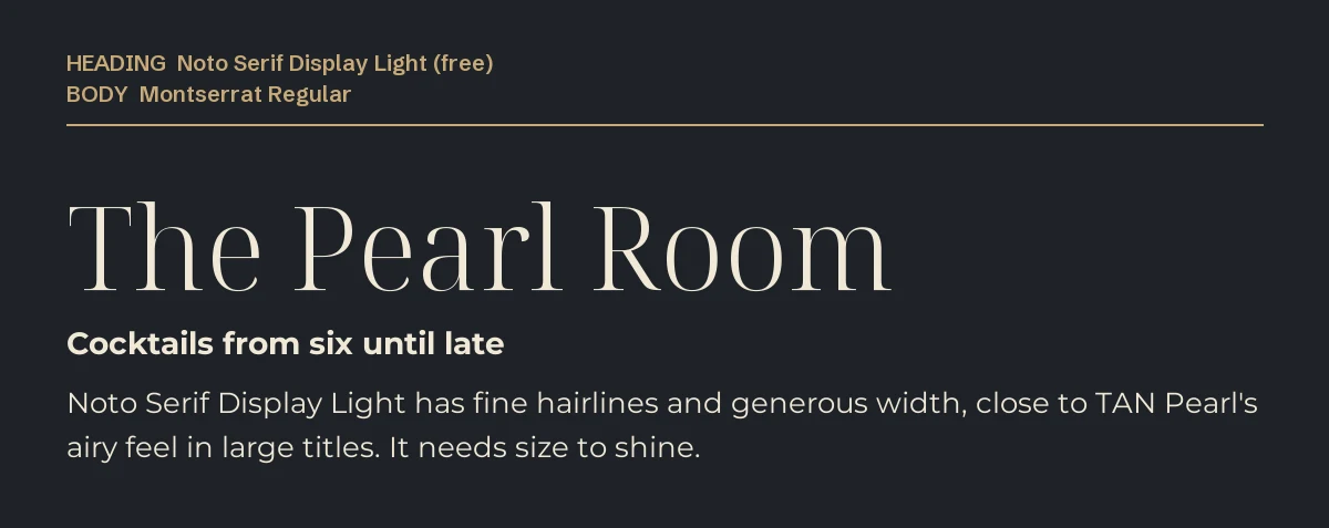
Noto Serif Display in its Light weight has fine hairlines and generous width, close to TAN Pearl’s airy feel in large titles. It is part of a very large family, so it also covers many languages.
It needs size to shine. Use it for big titles only, never for small text.
6. Italiana
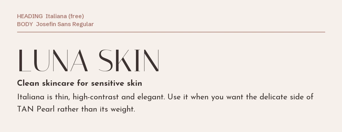
Italiana is thin, tall and elegant. It matches the delicate side of TAN Pearl rather than its weight, which suits skincare, spa and minimal fashion brands.
Set it in capitals with extra letter spacing, as in the example, for the most refined look.
How to get closer to the TAN Pearl look in Canva
- Step 1: Set the name or title in capitals. TAN Pearl is mostly seen in capitals, and the alternatives look closest that way too.
- Step 2: Add a little letter spacing. Wide, airy spacing is half of the premium impression.
- Step 3: Use one of the six fonts only for the headline, and pair it with a light sans such as Montserrat, Josefin Sans or Raleway for the rest. Our Raleway Canva pairing guide shows Raleway with other serifs.
- Step 4: If a font does not appear in your font menu, it is not in your Canva library. On Canva Pro you can upload font files through Brand Kit → Brand fonts; every free font on this page is open source, so uploading it is allowed.
When only the real TAN Pearl will do
If the curves are what you want, no free font will replace them. TAN Pearl is sold on Creative Market, where the product page lists its alternate letters and formats.
| Font | Designer | Price (desktop license) | Formats |
|---|---|---|---|
| TAN Pearl | TanType | $17 | OTF, TTF, WOFF |
The price was read from the Creative Market product page on 3 October 2026 and may change. Check the license terms on the product page for your type of project.
Once you have picked one of these fonts similar to TAN Pearl, our Cormorant Garamond Canva guide covers pairing ideas for a similar elegant style.
Frequently asked questions
Is there a free version of TAN Pearl?
TAN Pearl is a paid font from TanType. Some sites offer it as a “free download”, but commercial use needs a license from the designer. The six fonts on this page are genuinely free under the SIL Open Font License.
What is the closest free font to TAN Pearl?
Of the fonts similar to TAN Pearl on this page, Gilda Display is closest in proportions and overall feel, and Elsie in its playful shapes. Neither has TAN Pearl’s ribbon-like curves.
Can I use these alternatives commercially?
Yes. All six are open source under the SIL Open Font License, which allows commercial use including logos and client work.
What font pairs well with TAN Pearl?
A light, clean sans keeps the focus on the headline. Montserrat, Josefin Sans and Raleway all work, as shown in the examples above.
Why does TAN Pearl look different in my design than in templates?
Templates often use its alternate letters and generous letter spacing. Without those, the font looks plainer. The same is true of the free alternatives: spacing and capitals make a large difference.

Leave a Reply