
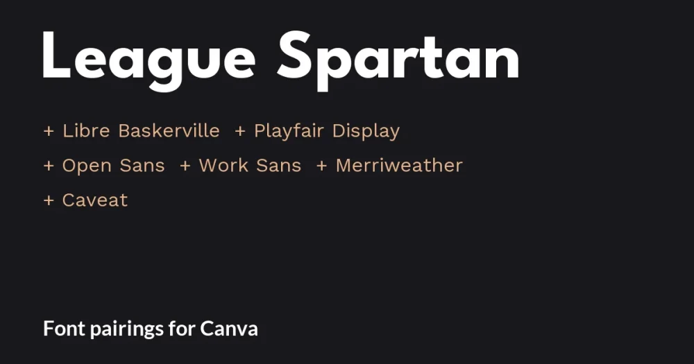
Quick answer: Pair League Spartan with Libre Baskerville for an editorial design, Open Sans for slides with numbers, or Caveat for a short handwritten accent. Keep League Spartan on the headline and use another font for small text or aligned prices.
League Spartan is the bold geometric sans that turns up on course launches, planner covers and small-business posts. It is The League of Moveable Type’s take on Matt Bailey’s Spartan, itself based on early 20th-century American geometric sans serifs, and it is now a full family of weights on Google Fonts, free under the SIL Open Font License.
Most people use it the same way: big, bold and in capitals. That makes the second font the one that decides the mood, and it is where most League Spartan font pairings in Canva go right or wrong. A bookish serif makes it feel editorial, a neutral sans makes it feel corporate, a handwritten accent makes it feel personal.
Each League Spartan font pairing below is shown in a layout you might build in Canva: a journal cover, a fashion post, a business slide, a product launch, a blog graphic and a bake-sale poster. Every partner is a free Google Font under the same open license.
League Spartan font pairing ideas at a glance
| Pair League Spartan with | Type | Works best for |
|---|---|---|
| Libre Baskerville | Book serif | Journals, blogs, editorial covers |
| Playfair Display | High-contrast serif | Fashion, beauty, lifestyle posts |
| Open Sans | Neutral sans | Business slides, reports, data |
| Work Sans | Friendly grotesque | Product launches, startups, apps |
| Merriweather | Screen serif | Long blog posts and how-to guides |
| Caveat | Handwritten accent | One personal note on a poster |
League Spartan in Canva: why the numbers will not line up
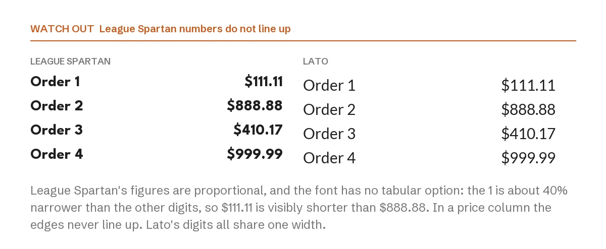
League Spartan’s figures are proportional, and the font has no tabular option to switch to. The digit 1 is about 40 percent narrower than the others, so $111.11 comes out visibly shorter than $888.88. In a headline that looks natural. In a price list, timetable or table it means the right edges of the numbers never align.
The fix is simple: keep League Spartan for words, and set columns of numbers in a partner whose digits share one width. Lato, shown on the right above, and Open Sans both do.
1. League Spartan + Libre Baskerville
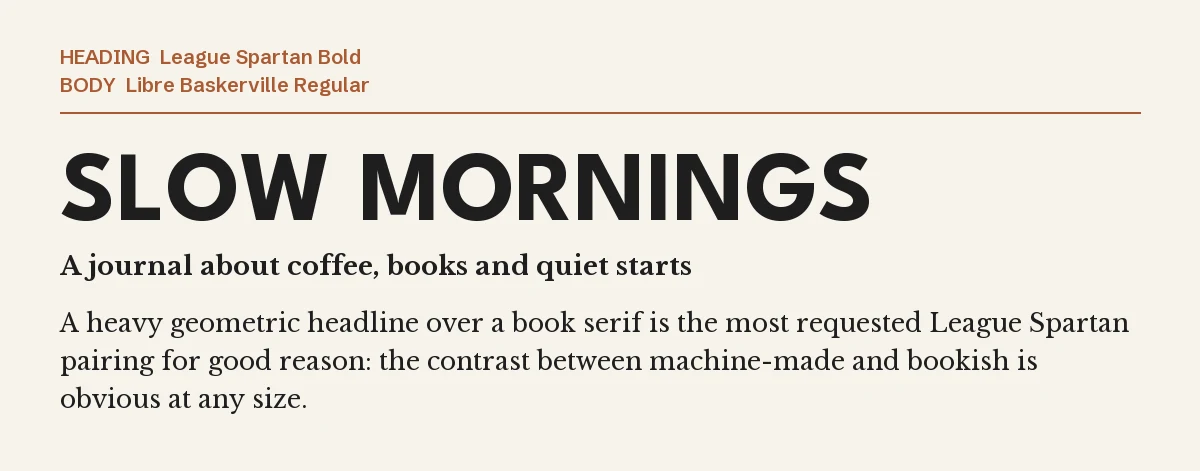
This is a strong starting point for an editorial design. A heavy geometric headline over a book serif sets machine-made against bookish, and the difference is obvious at every size.
Libre Baskerville sets wide, so give the text box a little extra room. More on that is in our Libre Baskerville Canva pairing guide.
2. League Spartan + Playfair Display
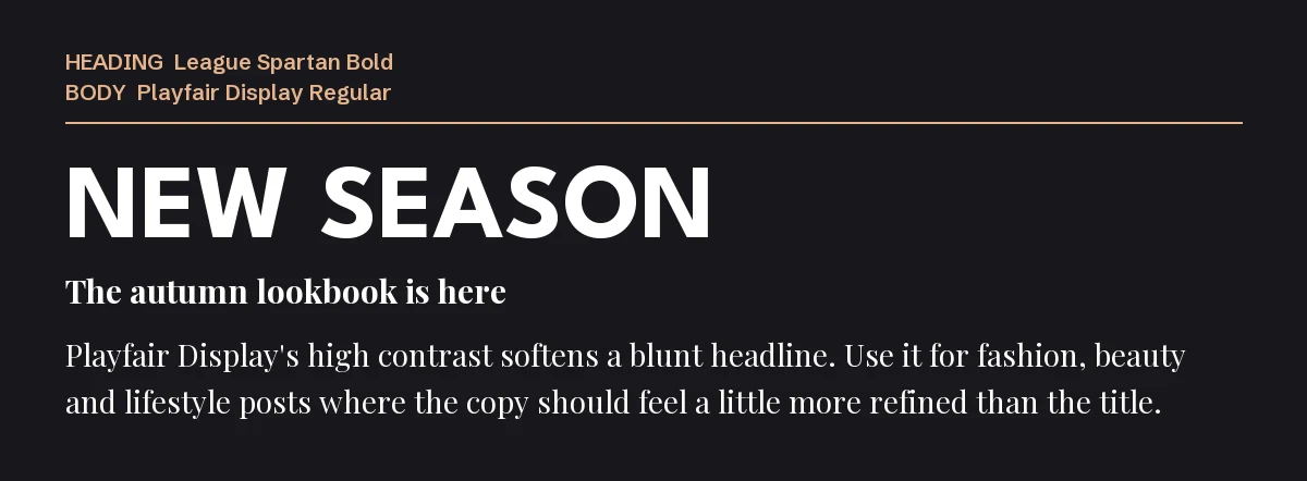
Playfair Display’s high contrast softens a blunt headline. The title stays confident and the copy underneath feels refined, which suits fashion, beauty and lifestyle content.
Keep Playfair to short copy and subheadings; its hairlines get fragile at very small sizes. See our Playfair Display font page for its weights.
3. League Spartan + Open Sans
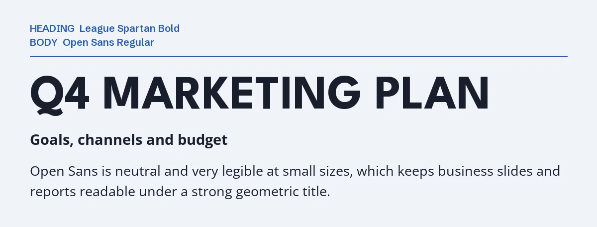
Open Sans is neutral and very legible at small sizes. Under a strong geometric title it keeps business slides, reports and dashboards readable, and its fixed-width figures solve the number problem above.
This is the safest choice when the design has more data than personality.
4. League Spartan + Work Sans
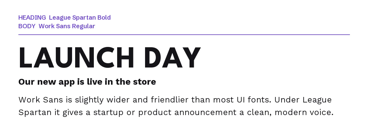
Work Sans is a little wider and friendlier than most interface fonts. Next to League Spartan it gives a product announcement or an app graphic a clean, modern voice without looking like a default template.
Use Work Sans Regular for text and its medium weight for buttons or labels.
5. League Spartan + Merriweather

Merriweather was drawn for reading on screens, so it carries longer text comfortably: blog graphics, carousel posts, step-by-step guides. The punchy title pulls people in and the serif keeps them reading.
Our Merriweather font page covers its styles.
6. League Spartan + Caveat
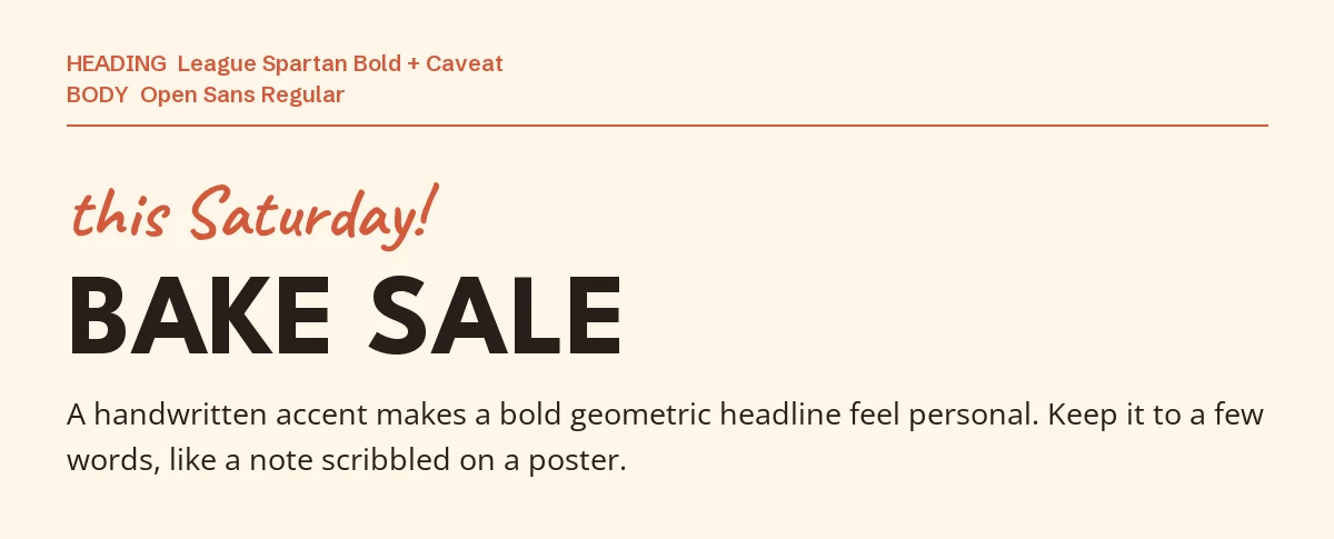
A handwritten accent turns a bold geometric headline into something personal, like a note scribbled on a poster. Caveat looks like quick marker handwriting and stays readable.
Three fonts, three jobs: accent, headline, details. Keep the accent to a few words.
One pairing to avoid: Montserrat Bold
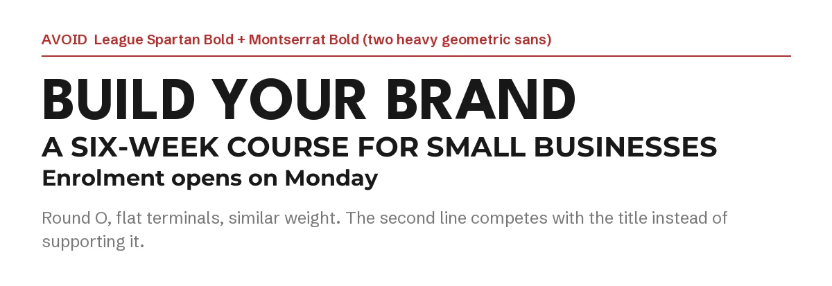
League Spartan and Montserrat share round O shapes, flat terminals and similar weights. Put both in bold and the second line competes with the title instead of supporting it.
If you like Montserrat, use it in a regular weight for body text, or use it instead of League Spartan. Our Poppins Canva guide covers another geometric favourite.
How to set up a League Spartan font pairing in Canva
- Step 1: Add a heading text box, search League Spartan and pick a bold weight. Capitals with a little extra letter spacing are its natural look.
- Step 2: Add a separate text box for the details and search for the partner font by name.
- Step 3: Put prices, times and table figures in the partner font, not in League Spartan, so they line up.
- Step 4: Search for each font in your Canva font menu first. If it is missing, get the font from Google Fonts and upload its TTF file on a plan that supports custom fonts, such as Canva Pro. Canva Free does not support custom font uploads. Check Canva’s font-upload requirements before importing.
If you want a geometric headline that is not League Spartan
League Spartan is free and everywhere, so a design built on it can look like a template. These two premium geometric sans fonts from Creative Market fill the same role with a less familiar face. If a font is not in your Canva library, using it there requires a plan with custom-font uploads and a license that permits embedding. Check the product license and Canva’s upload rules before buying.
| Font | Designer | Price (standard license) | Why consider it |
|---|---|---|---|
| Ostra Centra | Viswell | $19 | A geometric display sans with playful curves and ligatures, for logos and posters |
| Volda Sans | Yukita Creative | $19 | Seven weights from Light to Black with matching italics, so one family covers headline and text |
Prices were read from the Creative Market product pages on 3 October 2026 and may change.
The League Spartan font pairing rule stays the same: one strong geometric face for the headline, one partner with a different job.
Frequently asked questions
Can I use League Spartan commercially in Canva?
Yes. League Spartan is under the SIL Open Font License, which allows commercial use including logos, products and client work. You may not sell the font files themselves.
What is the best body font for League Spartan?
For a League Spartan font pairing, Libre Baskerville gives an editorial look and Open Sans suits business content. Both are clearly different from League Spartan, which is what makes a pairing work.
Why do my prices look uneven in League Spartan?
Its numbers have different widths and there is no tabular setting. Set prices in a partner font with fixed-width figures, such as Lato or Open Sans.
Is League Spartan the same as Montserrat?
No. Both are geometric sans fonts, but League Spartan is tighter and heavier in its bold weights, with a shorter lowercase. They are too similar to pair well.
How many fonts should one Canva design use?
Two in most cases, three when the third has a separate job, like the handwritten accent in pairing six. We cover Bebas Neue and other popular Canva fonts the same way.
Leave a Reply