
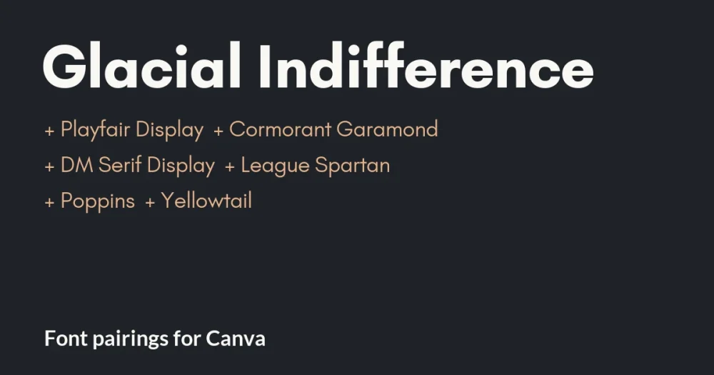
Glacial Indifference is the quiet geometric sans behind countless Instagram posts, Pinterest pins and small-business brand kits. Alfredo Marco Pradil of Hanken Design Co. drew it with a Bauhaus influence, and it is free under the SIL Open Font License. Round letters, even strokes, nothing loud.
That calm is why most Glacial Indifference font pairings in Canva put it underneath something with more character. It is rarely the star. It is the clean, modern voice that lets a serif or a script take the attention.
The six pairings below are shown in layouts you might build in Canva: a boutique post, a wedding brand, a workshop promo, a planner cover, a report slide and a market flyer. Every partner is a free Google Font, also under the Open Font License.
Glacial Indifference pairings for Canva at a glance
| Pair Glacial Indifference with | Type | Works best for |
|---|---|---|
| Playfair Display | High-contrast serif | Boutique brands, fashion, Instagram shops |
| Cormorant Garamond | Delicate display serif | Weddings, florists, photographers |
| DM Serif Display | Heavy display serif | Coaches, courses, workshop promos |
| League Spartan | Bold geometric sans | Planners, habit trackers, bold covers |
| Poppins | Geometric sans, bold | Slides, reports, business graphics |
| Yellowtail | Vintage script accent | Markets, events, one warm phrase |
Glacial Indifference in Canva sets smaller than you expect
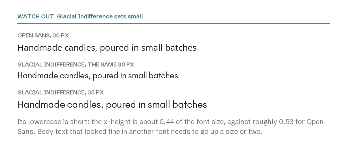
Glacial Indifference has short lowercase letters. Its x-height, the height of letters like a, e and x, is about 0.44 of the font size. Open Sans is about 0.53, and Poppins about 0.55. So at the same size in Canva, Glacial body text looks noticeably smaller and lighter.
When you swap it in for another sans, raise the size by one or two steps. And when you pair it with a serif, compare the two at the size people will actually read, not in the font menu.
1. Glacial Indifference + Playfair Display
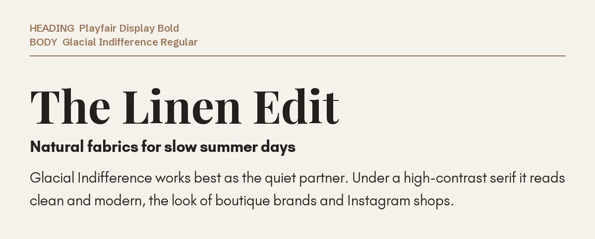
The most popular way to use Glacial Indifference, and the easiest to get right. Playfair Display’s high contrast brings the elegance, and Glacial keeps the details clean and current.
It is the look of boutique clothing brands, candle shops and lifestyle Instagram accounts. Details on the serif are on our Playfair Display font page.
2. Glacial Indifference + Cormorant Garamond
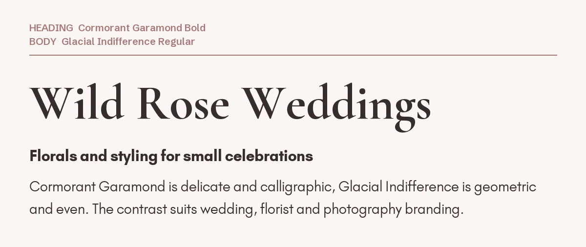
Cormorant Garamond is delicate and calligraphic; Glacial Indifference is geometric and even. The contrast between them is clear, which is what makes the pairing feel deliberate.
It suits wedding planners, florists and photographers. Cormorant runs small too, so test both at reading size; our Cormorant Garamond Canva guide explains why.
3. Glacial Indifference + DM Serif Display
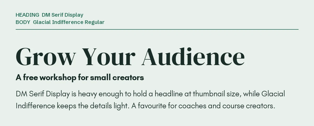
DM Serif Display is heavier than Playfair, so it holds a headline at thumbnail size. Paired with Glacial Indifference it gives the warm, trustworthy look that coaches and course creators often want.
Keep the headline short. DM Serif Display ships in one weight, so the hierarchy comes from size.
4. Glacial Indifference + League Spartan
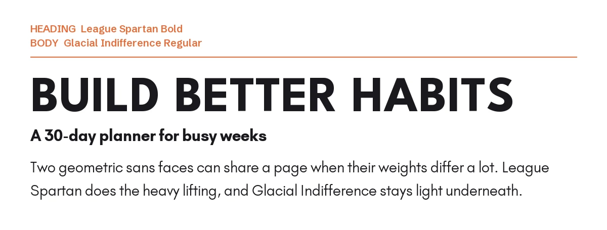
Two geometric sans fonts can work together when their weights are far apart. League Spartan Bold is heavy and compact; Glacial Indifference Regular is light and open. The headline lands first, the text follows.
This combination is common on planners, habit trackers and digital product covers.
5. Glacial Indifference + Poppins
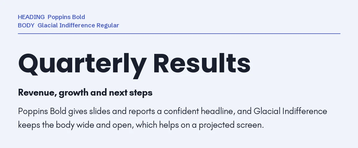
Poppins Bold gives slides and reports a confident, friendly headline. Glacial Indifference underneath keeps the body wide and airy, which helps on a projected screen.
Use Poppins only in bold here; at regular weight the two fonts are too close. Our Poppins Canva pairing guide covers more partners.
6. Glacial Indifference + Yellowtail
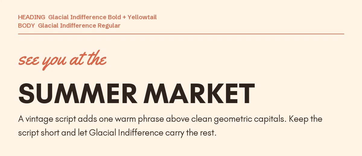
A vintage brush script adds warmth that a geometric sans cannot. Yellowtail is easy to read and slightly retro, which suits markets, pop-ups and community events.
Here Glacial Indifference Bold sets the headline in capitals, and the script carries just three words.
One pairing to avoid: Montserrat
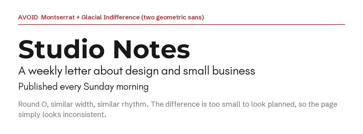
Montserrat and Glacial Indifference are both geometric, with round letters and similar widths. Montserrat’s taller lowercase makes the two look almost alike, but not quite. Readers will not name the difference; they will just feel the page is inconsistent.
If you want a sans headline over Glacial, go much heavier, as with League Spartan, or use a serif.
How to set the pairing in Canva
- Step 1: Add your headline first in the partner font. Glacial Indifference usually works best as the supporting voice.
- Step 2: Add a body text box, search Glacial Indifference and set it one or two sizes larger than you would set another sans.
- Step 3: Use Glacial Indifference Bold for small labels or a subheading, not a second display font.
- Step 4: If a font does not appear in your font menu, it is not in your Canva library. On Canva Pro you can upload font files through Brand Kit → Brand fonts; every font on this page is open source, so uploading it is allowed.
If you want a geometric sans that is not Glacial Indifference
Glacial Indifference is free and widely used, so templates built on it start to look alike, and its free release offers a limited set of weights. These two premium geometric families from Creative Market cover far more ground. Both need Canva Pro to upload through Brand Kit, and their license terms are on the product pages.
| Font | Designer | Price (standard license) | Why consider it |
|---|---|---|---|
| Mansfield | Umitype | $49 | 9 weights and 18 styles including italics, inspired by Futura and Avant Garde |
| Altone | Eko Bimantara | $89 | 9 weights from Thin to Heavy, each with a matching oblique, plus variable fonts |
Either way, the principle holds: a calm geometric sans works best next to something with more personality.
Frequently asked questions
Can I use Glacial Indifference commercially in Canva?
Yes. Glacial Indifference is released under the SIL Open Font License, which allows commercial use including logos, products and client work. You may not sell the font files on their own.
Why does Glacial Indifference look smaller than other fonts?
Because its lowercase letters are short. At the same point size, its x-height is roughly a fifth lower than fonts like Open Sans or Poppins, so it needs a slightly larger size to look equal.
What font goes with Glacial Indifference for a logo?
A serif with character, such as Playfair Display or Cormorant Garamond, for the name, with Glacial Indifference for the tagline. That is the pairing in examples one and two.
Is Glacial Indifference a Google Font?
It is not distributed through Google Fonts. It is published by Hanken Design Co. as an open-source font under the SIL Open Font License, so it is free for personal and commercial use.
How many fonts should one Canva design use?
Two in most cases. A third only belongs when it has a different job, like the script in pairing six. We cover Poppins and other popular Canva fonts in the same way.
Leave a Reply