
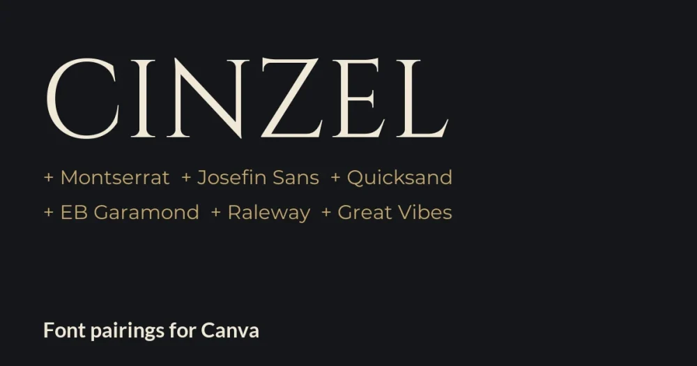
Cinzel is the font that makes a name look carved in stone. Natanael Gama based it on Roman inscriptions from the first century, and it has become a favourite for luxury brands, wedding stationery, hotel signage and book covers. It is free under the SIL Open Font License, with weights from Regular to Black.
Before you choose a Cinzel font pairing in Canva, know one thing about how it behaves: Cinzel has no true lowercase. Classical Roman lettering had only capitals, so Cinzel’s lowercase keys give you smaller capitals instead. That makes it a superb title font and a poor reading font, and it decides which partners work.
The six pairings below are shown in layouts you might build in Canva: a fragrance brand, a skincare studio, a save-the-date, a history book, a property flyer and a wedding invitation. Every partner is a free Google Font under the same open license.
Cinzel pairings for Canva at a glance
| Pair Cinzel with | Type | Works best for |
|---|---|---|
| Montserrat | Geometric sans | Luxury brands, packaging, price lists |
| Josefin Sans | Light vintage sans | Beauty, spa and salon branding |
| Quicksand | Rounded sans | Minimal weddings, signage, thank-you cards |
| EB Garamond | Classical text serif | Book covers, museums, history content |
| Raleway | Elegant thin sans | Real estate, hotels, event programmes |
| Great Vibes | Formal script accent | Wedding invitations, one romantic phrase |
How Cinzel’s small capitals change your text in Canva
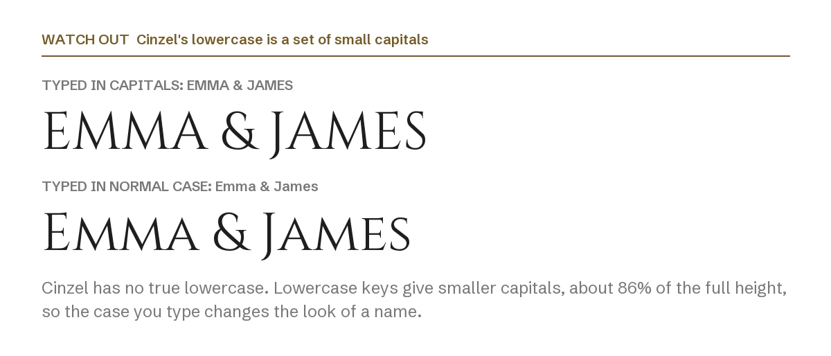
Type a name in capitals and every letter is full height. Type it in normal case and the first letter stays tall while the rest drop to about 86 percent of that height. Both are legitimate looks; the mistake is mixing them by accident across one design.
Pick one style for names and titles and keep it everywhere. And because even the small capitals are capitals, long text in Cinzel is slow to read. The partner font should carry anything longer than a line.
1. Cinzel + Montserrat
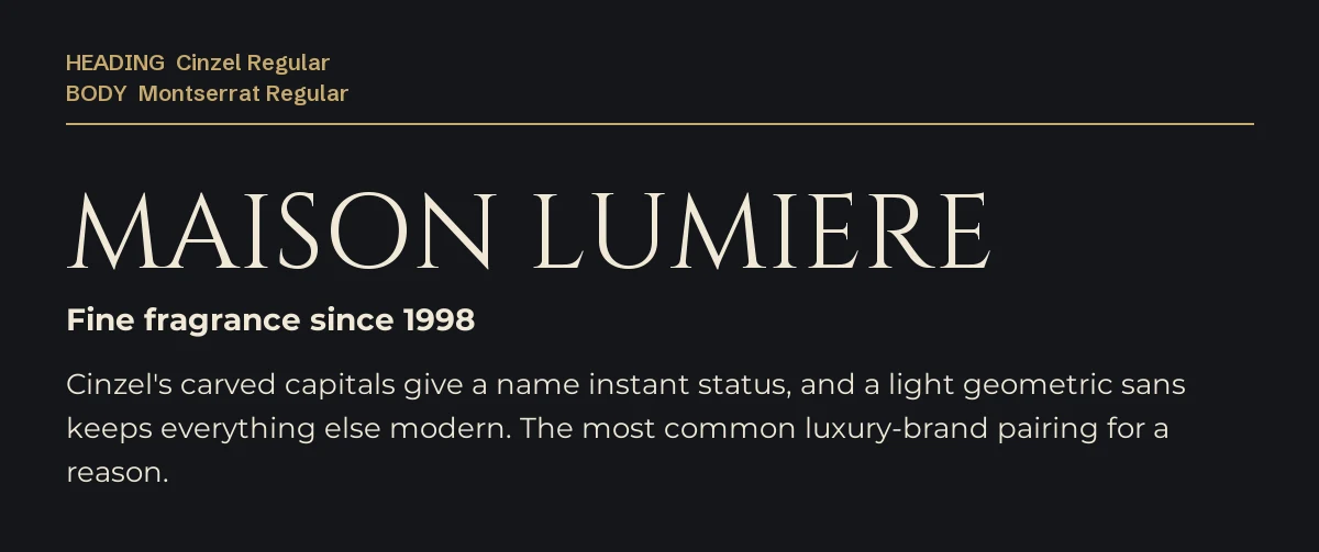
The most common Cinzel pairing, and for good reason. The carved capitals give a brand name instant status, and a clean geometric sans keeps the rest modern instead of antique.
Use Montserrat Regular for text and light letter spacing on short labels. It suits fragrance, jewellery, packaging and premium price lists.
2. Cinzel + Josefin Sans
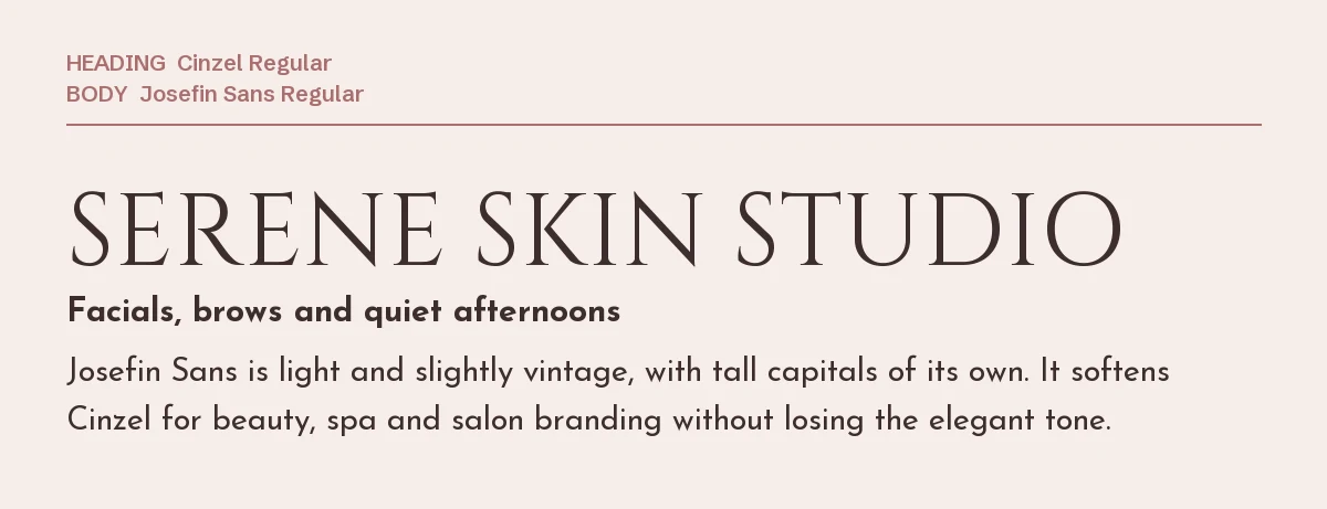
Josefin Sans is light, geometric and slightly vintage, with tall capitals of its own. It softens Cinzel without cheapening it, which is why it shows up so often in beauty and spa branding.
Its lowercase is short, so set it a size larger than you would set Montserrat.
3. Cinzel + Quicksand
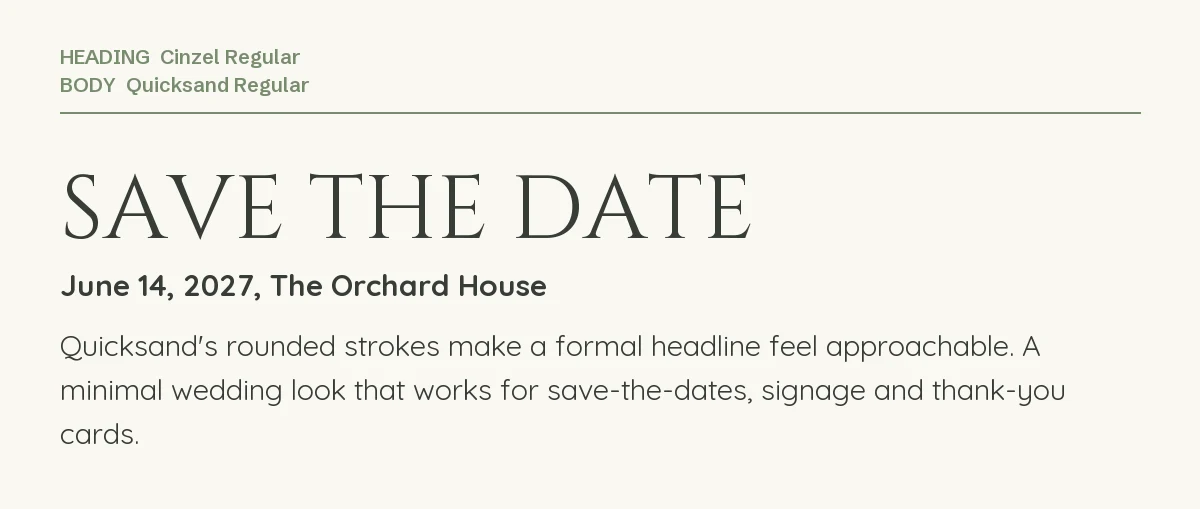
Quicksand’s rounded strokes turn a formal headline into something approachable. This is the minimal wedding look: lots of space, soft colours, nothing fussy.
It works for save-the-dates, welcome signs and thank-you cards. Our Quicksand font page covers its weights.
4. Cinzel + EB Garamond
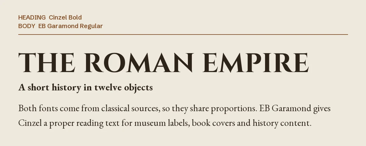
Most guides tell you never to pair two serifs. This is the exception, because the two fonts come from neighbouring traditions: Roman capitals on top, a classical book face underneath. They share proportions, so the result looks intended.
Use it for book covers, museum labels, history content and anything that should feel scholarly. Note that this example uses Cinzel Bold; a heavier weight helps the title stand apart from the text serif.
5. Cinzel + Raleway

Raleway’s thin, even strokes keep property details clean under a formal name. The combination reads as expensive without trying hard, which is why it suits real estate flyers, boutique hotels and event programmes.
Watch Raleway’s numbers, which can sit lower than you expect. Our Raleway Canva pairing guide explains the fix.
6. Cinzel + Great Vibes
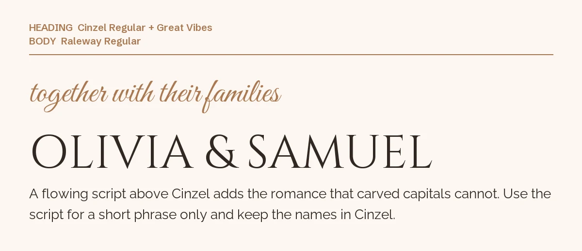
Carved capitals are formal but cool. A flowing script adds the romance, and Great Vibes is one of the most legible formal scripts available for free.
Keep the script to a short phrase and the names in Cinzel, as here. Our Great Vibes font page has the license details.
One pairing to avoid: Marcellus
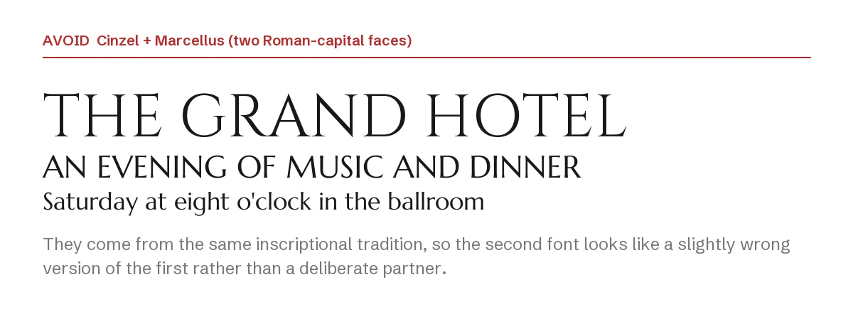
Marcellus, Trajan-style faces and Cinzel all descend from the same inscriptional lettering. Put two together and the second does not look like a partner; it looks like a slightly wrong copy of the first.
If you want a second elegant serif, choose a reading face like EB Garamond, or our Cormorant Garamond Canva guide for a lighter, more calligraphic option.
How to set the pairing in Canva
- Step 1: Add a heading text box, search Cinzel and decide now whether names will be typed in capitals or in normal case. Keep that choice across the whole design.
- Step 2: Add generous letter spacing to short Cinzel lines. Inscriptional capitals look best with air between them.
- Step 3: Add a separate text box for details and search for the partner font by name. Keep body text out of Cinzel.
- Step 4: If a font does not appear in your font menu, it is not in your Canva library. On Canva Pro you can upload font files through Brand Kit → Brand fonts; every font on this page is open source, so uploading it is allowed.
If you want a luxury serif that is not Cinzel
Cinzel’s popularity is now its problem: the same carved capitals appear on thousands of wedding templates. These two premium display serifs from Creative Market keep the upscale tone with a less familiar face. Both need Canva Pro to upload through Brand Kit, and their license terms are on the product pages.
| Font | Designer | Price (standard license) | Why consider it |
|---|---|---|---|
| Montage | Sensatype | $19 | A cinematic display serif made for logos and titles, in OTF, TTF, WOFF and WOFF2 |
| Runalto | Sensatype | $29 | Eighteen fonts in one luxury serif family with a real lowercase, so it can set more than a single line |
The same rule applies: one display serif for names and titles, one quiet partner for the rest.
Frequently asked questions
Can I use Cinzel commercially in Canva?
Yes. Cinzel is under the SIL Open Font License, which allows commercial use including logos, packaging and client work. You may not sell the font files themselves.
Why does Cinzel look different when I type in lowercase?
Because it has no lowercase letters. The lowercase keys produce small capitals, so “Emma” shows a full-height E followed by shorter capitals.
What font goes with Cinzel for a wedding invitation?
Great Vibes for one script phrase, with Quicksand or Raleway for the details. That keeps the invitation formal, romantic and still easy to read.
Is Cinzel the same as Trajan?
No, but both are based on Roman inscriptional capitals, so they look related. Trajan is a commercial typeface; Cinzel is free and open source.
How many fonts should one Canva design use?
Two in most cases. A third, like the script in pairing six, should only appear when it has a separate job. We cover Raleway and other popular Canva fonts the same way.
Leave a Reply