

Newsreader font free download: the ZIP below holds 2 font files with 2 variable axes and 658 glyphs, plus the OFL licence.
Yes — Newsreader is free for commercial use, including in books and long-form work you sell
Newsreader is released under the SIL Open Font License 1.1 (OFL). You can use it in client work, logos, products you sell, apps, and print, without paying or asking permission.
Newsreader was designed by Hugues Gentile at Production Type, built specifically for continuous on-screen reading in content-rich environments — the brief was long-form text, not headlines. That’s the opposite design goal from most of the display faces free-font sites default to, and it shows up directly in the two variable axes it ships with.
We verified the license directly from the font file, not from a third-party listing. The embedding permission flag (fsType) is set to 0 — Installable Embedding, the least restrictive value in the OpenType spec.
Quick facts
| Designer | Production Type |
| Added to Google Fonts | July 2020 |
| Version | 1.003 |
| License | SIL Open Font License 1.1 |
| Commercial use | Yes, no attribution required |
Embedding (fsType) | 0 — Installable, unrestricted |
| Variable font | Yes, two axes (Optical Size 6–72, Weight 200–800) |
| Weights | 7 (200 ExtraLight → 800 ExtraBold) |
| Glyphs | 658 |
| Characters covered | 564 |
| OpenType features | 11 |
| Vietnamese support | Yes, full |
| Formats | Variable TTF |
Download Newsreader
What’s in the download
The download is a single ZIP containing 2 font files plus the licence:
| File | What it is |
|---|---|
| Newsreader-Italic[opsz,wght].ttf | Variable italic — 2 axes: Optical Size, Weight |
| Newsreader[opsz,wght].ttf | Variable upright — 2 axes: Optical Size, Weight |
OFL.txt travels with the files — keep it in the folder if you pass the font on to anyone else. Total download 560 KB.
The download includes the OFL license file. Keep it in the package if you redistribute the font.
Need a more ornamental display serif to pair with it? Newsreader is built for readability at text sizes, not for a decorative headline. Netsera on theassetcrate is a calligraphic display serif with 170+ ligatures and alternates that works well as a headline paired with Newsreader for body copy.
Internal link to our own Premium Spotlight coverage — not an external ad.
What the OFL license actually lets you do
You can:
- Use Newsreader in commercial projects, including client work you bill for
- Use it in a logo or brand identity and trademark that logo
- Sell products that use it — merchandise, packaging, book covers
- Embed it in websites, apps, games, PDFs and ebooks
- Modify it and redistribute your modified version
You cannot:
- Sell the font file on its own, outside a larger bundled product
- Distribute it without the OFL license file
- Release a modified version under a Reserved Font Name
No attribution is required in your design. The OFL only asks that the license travel with the font files.
Inside the file: 658 glyphs and 564 characters
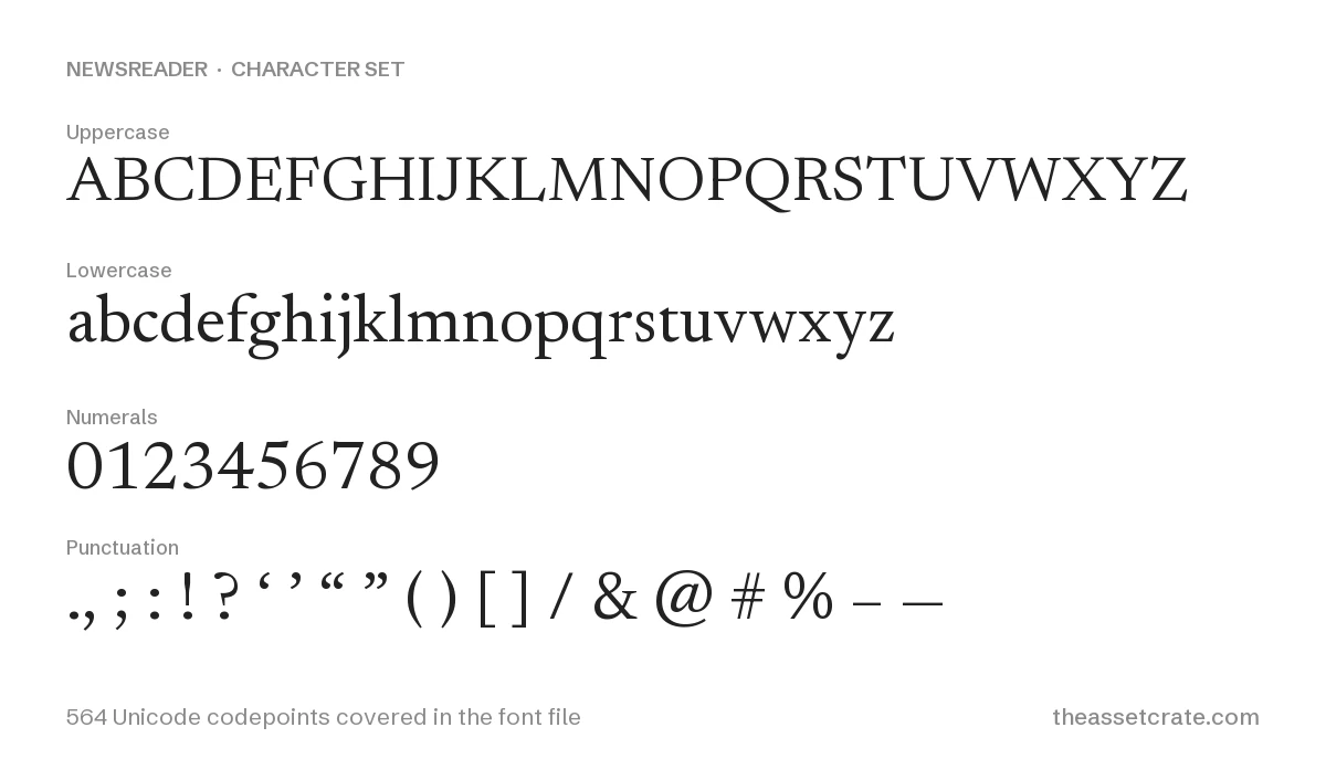
Newsreader ships 658 glyphs covering 564 Unicode codepoints.
Vietnamese, and 12 other languages in full
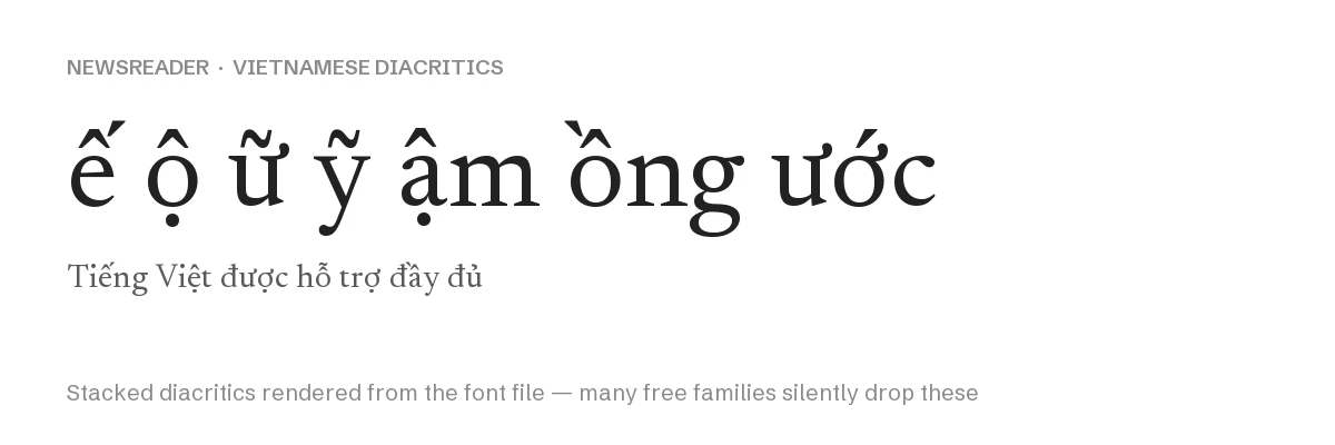
Tested against the full alphabets of 15 languages, Newsreader fully covers:
Vietnamese · Spanish · French · German · Portuguese · Italian · Polish · Czech · Turkish · Romanian · Hungarian · Dutch · Nordic (Danish, Norwegian, Swedish)
Vietnamese is fully supported, including stacked diacritics like ế, ộ, ữ and ỹ — this is the same tier of coverage as Montserrat, and worth calling out because most editorial/text-focused serifs skip it entirely.
Which Unicode blocks those 564 characters cover
| Block | Covered |
|---|---|
| Basic Latin | 95 / 96 |
| Latin-1 Supplement | 96 / 96 |
| Latin Extended-A | 124 / 128 |
| Latin Extended Additional | 97 / 256 |
| Latin Extended-B | 62 / 208 |
| General Punctuation | 20 / 112 |
| Currency Symbols | 16 / 48 |
OpenType features: 11, built for running text
| Feature | What it does |
|---|---|
liga | Standard ligatures |
case | Case-sensitive punctuation forms |
pnum / tnum | Proportional and tabular figures |
sups | Superscript |
ordn | Ordinals |
locl | Localized letterforms |
kern / mark / mkmk | Kerning and diacritic positioning |
This is a text-composition feature set (ligatures, figure styles, localization) rather than a display-font feature set (no stylistic sets, no swashes) — consistent with the “built for reading” brief.
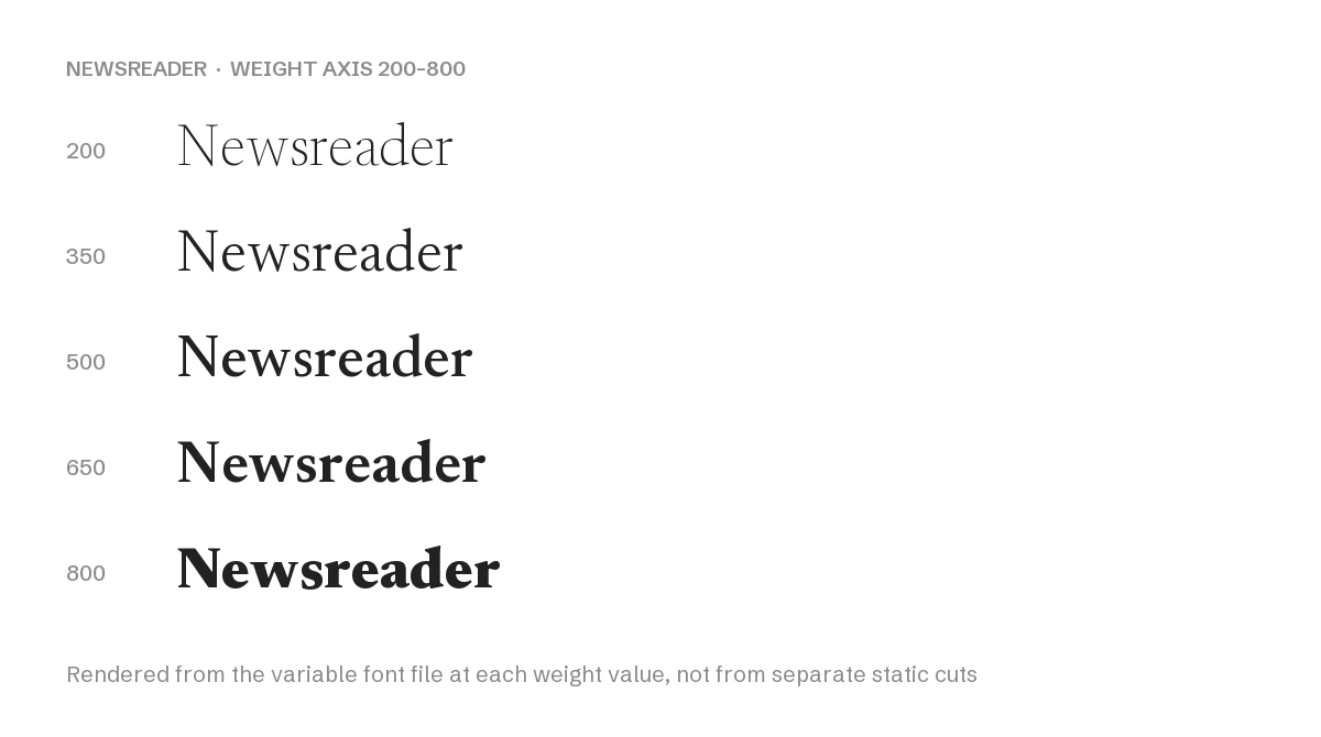
Two variable axes: Weight and Optical Size
Newsreader ships two variable axes, which is unusual for a free font:
- Weight: 200 (ExtraLight) to 800 (ExtraBold), continuous
- Optical Size: 6 to 72, continuous, default 18
Optical size is the less common axis. At low optical-size values the letterforms are drawn with more open counters and sturdier hairlines for small-size legibility; at high values the contrast increases and the design tightens up for display use. In CSS this is the font-optical-sizing property combined with a font-variation-settings: "opsz" — most browsers will drive this automatically from font-size if font-optical-sizing: auto is set, without extra CSS on your part.
A low x-height (0.426) — drawn for display and long reading
| Metric | Value |
|---|---|
| Units per em | 2,000 |
| Ascender | 1,470 |
| Descender | −530 |
| Cap height ratio | 0.670 |
| x-height ratio | 0.426 |
The x-height ratio of 0.426 is on the lower side, typical of a text serif designed to be set at small sizes over long passages — a generous x-height helps display faces more than it helps a book-length reading face, where too-large lowercase letters make text feel cramped at 6–8pt equivalents.
Right for long reading, wrong at poster size
Good fit: long-form editorial content, articles, ebooks, documentation — anywhere the optical-size axis can do real work — and any commercial project needing Vietnamese support with zero license risk.
Poor fit: short punchy headlines or logotypes, where a display-only face with more character will read better; Newsreader is optimized for restraint, not impact.
Building a full editorial type system? A licensed serif superfamily with a matched display companion is usually more consistent than assembling one from free parts:
Serif families on Creative Market
Affiliate link — commission at no cost to you.
More free serif coverage
- Netsera Font: Calligraphic Serif, 170+ Ligatures — premium display serif pairing
- [Free Fonts with Vietnamese Support]() — Newsreader included
License and technical data on this page was read directly from the font binary — fsType embedding bits, glyph counts, character coverage, and OpenType feature tables — not copied from a third-party listing. Last verified against Newsreader version 1.003.


Leave a Reply