
Maple sundae font — by The Native Saint Club, $22.95 desktop license, 15% off listed $27. Every figure below comes from the seller’s own listing.
Quick facts (verified from the Creative Market listing)
| Designer / Foundry | The Native Saint Club |
| Price | $22.95 desktop license, 15% off listed $27 (also Webfont/E-pub/App tiers) |
| Style | Sans serif duo |
| Fonts included | 2: Maple Sundae Sans (chunky, rounded), Maple Sundae Script (flowing, handwritten) |
| Formats | OTF, TTF, WOFF |
Why it stands out
The pairing logic is straightforward: a chunky rounded sans for a primary label/logo mark, and a separate flowing script sized to work as a secondary accent line underneath it — the kind of two-tier hierarchy product packaging and greeting cards typically need, sold as one matched set instead of two unrelated purchases.
Priced under $23 for the desktop license, it sits toward the affordable end of the duo/bundle fonts on this list.
Popular on Creative Market as of 15/8/2026. Pricing and specs pulled directly from the product listing — verify current price/license before purchase, as Creative Market pricing can change.
Is there a free alternative to Maple Sundae?
In two halves. Maple Sundae is a chunky sans plus script duo; both registers exist free, from separate designers.
| Free font | What it matches | What you give up |
|---|---|---|
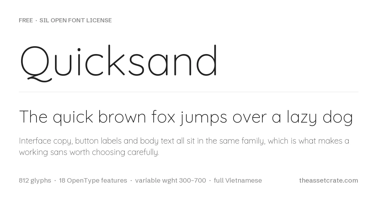
| Quicksand | Rounded geometric sans that carries the chunky-friendly half | Lighter in feel than a true chunky display |
| Nunito | Rounded sans superfamily with a weight axis running to 1000, so you can push it far heavier than Quicksand goes | Rounded terminals only in the original cut, not a display face |
| Dancing Script | Casual script for the handwritten half | Not drawn to pair with any particular sans |
Every font in that table is released under the SIL Open Font License, is free for commercial use including client work, and can be downloaded from this site with its licence file included. The figures come from the font binaries, not from a listing.
When the paid font is worth it. Buy the duo when you want the two halves to share proportions and spacing — that agreement is what you are actually paying for in a font duo.
Where this sits among the other font duos
If you are still deciding, our Handwritten Fonts comparison puts 16 premium faces side by side on the specifications that actually differ between them — desktop price, glyph count, ligature and alternate sets, included file formats and language coverage — with every figure read from the seller’s own listing rather than estimated.
That comparison is worth reading before any single purchase, because the two specifications that most often decide whether a font survives a real project are the two sellers are least consistent about publishing: whether web formats (WOFF, WOFF2) are in the download at all, and whether the character set extends past basic Latin to the accented characters your client’s name might need. Both are listed for every font in the comparison, including the ones where the seller publishes nothing and we say so.
Leave a Reply