
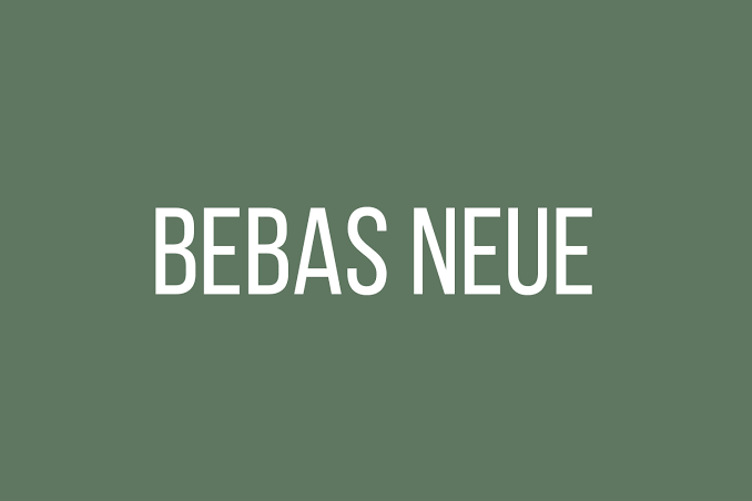
Bebas Neue is the tall, narrow, capitals-only sans behind a huge share of gym posters, sale banners and YouTube thumbnails. Ryoichi Tsunekawa of Dharma Type drew it, and the open-source version is free under the SIL Open Font License, which is a big part of why it is everywhere.
Two facts shape every Bebas Neue font pairing in Canva. It has no lowercase letters, and the free version comes in a single weight. That makes it an excellent headline and an impossible paragraph, so the second font is not decoration. It does all the reading work.
Below are six partners, each shown in a layout you might build in Canva: a gym promo, a webinar slide, a product post, a fashion feature, a cafe menu and a retro event flyer. All six partners are free Google Fonts under the same open license.
Bebas Neue pairings for Canva at a glance
| Pair Bebas Neue with | Type | Works best for |
|---|---|---|
| Montserrat | Wide geometric sans | Fitness, promos, bold social posts |
| Lato | Warm humanist sans | Webinars, slides, LinkedIn graphics |
| Open Sans | Neutral sans | Product posts, prices, small print |
| Playfair Display | High-contrast serif | Fashion, beauty, editorial covers |
| Lora | Soft text serif | Menus, food blogs, community flyers |
| Pacifico | Retro script accent | One friendly phrase on an event flyer |
Why Bebas Neue needs a partner for body text
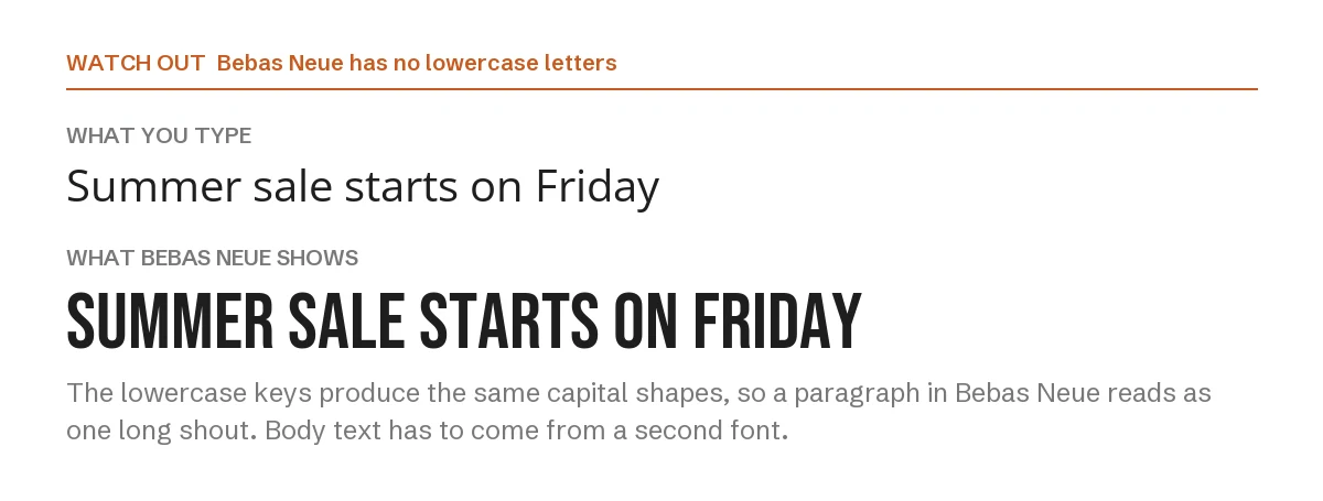
Type a sentence in normal case and Bebas Neue shows it in capitals anyway. The lowercase keys simply produce capital shapes. That is fine for four words. For a paragraph it reads as one continuous shout, and capitals take longer to read because every word becomes the same rectangle.
The single weight adds a second limit: you cannot make a lighter subheading in Bebas. Hierarchy has to come from size or from the partner font, which is why every layout below keeps Bebas for the headline only.
1. Bebas Neue + Montserrat

This is the pairing most people reach for first, and it earns its place. Bebas Neue is narrow and tall, Montserrat is wide and round. Because their widths are so different, the headline and the details never look like the same voice.
Use Montserrat at regular weight for body text and bold for a single subheading. It suits gyms, sports clubs, sales and anything that should feel energetic.
2. Bebas Neue + Lato
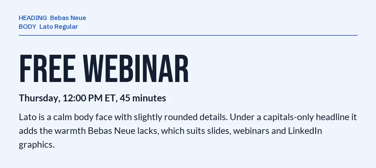
Lato has slightly rounded details that warm up a layout. Under a capitals-only headline it takes the edge off, which matters on slides and webinar graphics where you want to look confident rather than loud.
It also holds up when a presentation is projected or shrunk into a thumbnail, so it is a safe pick for business and education content.
3. Bebas Neue + Open Sans
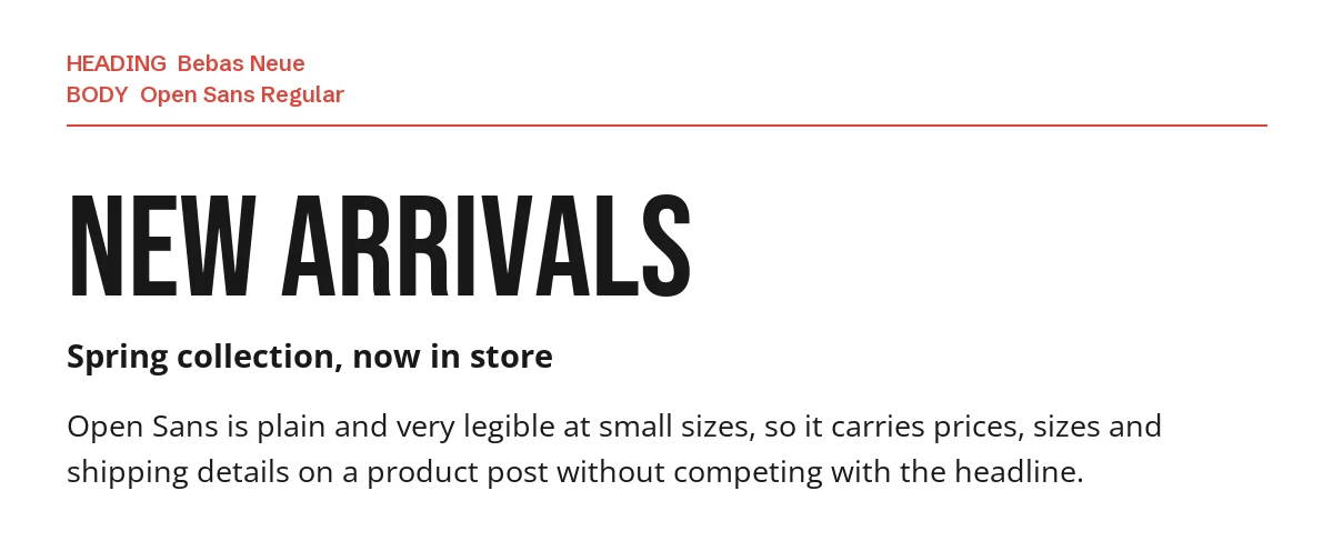
Open Sans is about as neutral as a sans gets. That is exactly what product posts need: prices, sizes, delivery dates and return details, all legible at small sizes without pulling attention from the headline.
If your design carries lots of small print, start here.
4. Bebas Neue + Playfair Display
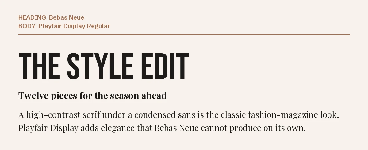
A high-contrast serif under a condensed sans is the classic fashion-magazine look. Playfair Display brings the elegance Bebas Neue cannot produce by itself, so the layout feels styled rather than shouted.
Keep Playfair for the subheading and short copy. Its thin strokes get fragile at very small sizes. More on the family is on our Playfair Display font page.
5. Bebas Neue + Lora
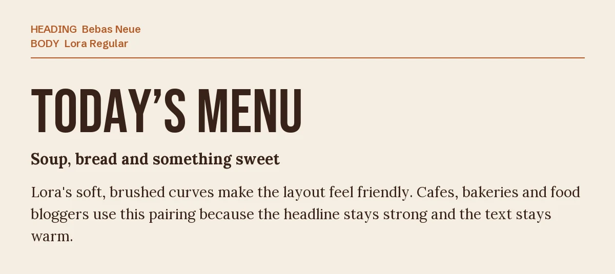
Lora’s soft, brushed curves make a strong headline feel friendly. Cafes, bakeries and food bloggers use this combination because the title still stands out while the text below feels homemade.
Lora is comfortable at paragraph length, so it is the right partner when the design actually has something to say. See our Lora font page for its weights.
6. Bebas Neue + Pacifico
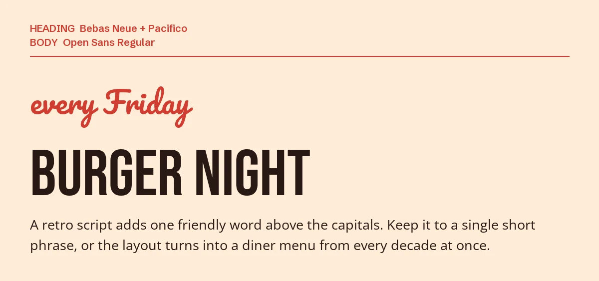
A retro script turns a blunt headline into an invitation. Pacifico is round and casual, and one short phrase above the Bebas title is all it needs to do.
Notice that this layout uses three fonts with three separate jobs: script accent, headline, details. Add a fourth and the flyer stops looking designed.
One pairing to avoid: Fjalla One
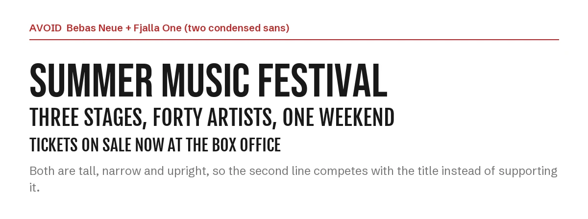
Fjalla One, Oswald, League Gothic and Bebas Neue are all tall, narrow and upright. Put two of them together and the second line has nearly the same presence as the title, so nothing tells the eye where to start.
If you prefer one of those faces, use it instead of Bebas Neue. Our Oswald Canva pairing guide covers Oswald’s partners, and the Anton guide covers the heavier alternative.
How to set the pairing in Canva
- Step 1: Add a heading text box, search Bebas Neue and type your headline. It will appear in capitals whatever case you type.
- Step 2: Add a separate text box for everything else and search for the partner font by name. Do not try to set the body in Bebas.
- Step 3: Give the headline extra letter spacing only if it is short. Bebas Neue is already tightly fitted, and wide spacing on a long line looks unfinished.
- Step 4: If a font does not appear in your font menu, it is not in your Canva library. On Canva Pro you can upload font files through Brand Kit → Brand fonts; every font on this page is open source, so uploading it is allowed.
If you want a condensed headline that is not Bebas Neue
Bebas Neue is free and familiar, which is also its weakness: a design that uses it looks like a thousand others. These two premium condensed faces from Creative Market each solve one of its limits. Both need Canva Pro to upload through Brand Kit, and their license terms are on the product pages.
| Font | Designer | Price (standard license) | Why consider it |
|---|---|---|---|
| Knolt | SilverStag Type Foundry | $39 | Ultra-condensed with a full uppercase and lowercase set, sharp ink traps and over 100 ligatures |
| Joya Sans V2 | BTYPE | $26 | Still all caps, but in five weights from Thin to Bold, so the subheading can be a lighter cut of the same family |
The pairing rules stay the same: one condensed face for the headline, one calm partner for the reading.
Frequently asked questions
Can I use Bebas Neue commercially in Canva?
Yes. The free Bebas Neue is released under the SIL Open Font License, which allows commercial use, including logos, merchandise and client work. You cannot sell the font files themselves.
Why does Bebas Neue only type in capitals?
Because it was designed as a capitals-only display face. The lowercase keys map to the same capital letters, so changing the case of your text has no effect.
What font goes with Bebas Neue for a YouTube thumbnail?
Montserrat Bold or Open Sans Bold. A thumbnail is read at a small size, so the second line needs a wide, plain sans that stays legible; a thin serif or a script will disappear.
Is Bebas Neue the same as Oswald?
No. Both are condensed, but Oswald has lowercase letters and several weights, so it can set subheadings too. Bebas Neue is capitals only and is best kept for the headline.
How many fonts should one Canva design use?
Two in most cases, three when the third has a clearly separate job like the script in pairing six. We cover Poppins and other popular Canva fonts in the same format.
Leave a Reply